Have you noticed how the most successful online food businesses seem to effortlessly convert visitors into customers while others struggle to make a single sale?
Why do you sometimes feel an irresistible urge to click "Buy Now" on one website, but scroll past another without a second thought?
What’s the secret behind those persuasive buttons that make people take action?
The answer?
A powerful Call to Action (CTA).
A CTA helps turn visitors into paying customers.
It’s not just about the button, but the way it pushes someone to make a decision.
But not all CTAs are created equal.
Some spark curiosity, and some create urgency.
In this guide, we’ll break down what a call to action is, why it is important for your eCommerce sales, and also give you seven high-converting CTA examples you can use right now.
What is a Call to Action (CTA)?
A Call to Action (CTA) is a direct and engaging prompt used to encourage your audience to take an immediate and specific action.
This could be anything from clicking a link, completing a purchase, signing up for a newsletter, or even downloading an ebook.
The secret to a great CTA is clarity, it tells people exactly what they should do next and why it benefits them.
CTAs can be as simple as a ‘Buy Now’, ‘Add to Cart’, ‘Subscribe’, etc.
And guess what? A well-crafted CTA can take your conversion rates from 0 to 100 and boost your sales, but only if done right.
For e-commerce sites, CTAs are usually associated with product pages, the checkout process, or promotional offers.
They stand out, grab attention, and motivate customers to act quickly.
People Also Read: How to Write a Product Description
Why is a Call to Action Important for Your eCommerce Sales?
CTAs are important because they’re often the final push needed to convert browsers into buyers.
A strong CTA provides clear direction, making it easier for your customers to navigate their buying decisions.
Without a CTA, visitors might leave your website or get distracted, causing missed opportunities.
Here are 3 reasons why a CTA matters:
- A clear CTA removes any confusion. When customers know exactly what to do next, they’re more likely to follow through.
2. A well-written CTA can instill a sense of urgency, pushing customers to act faster.
3. With persuasive and strategically placed CTAs, you can guide users to their next step, increasing your chances of a sale.
The 3 C’s in a Call to Action
1. Clear
Your CTA should leave no room for confusion.
Use simple and direct language to tell your audience exactly what you want them to do next.
It could be “Shop Now,” “Sign Up,” or “Get Started”. Your customers should know the action they’re taking at a glance.
2. Concise
Keep it short and sweet.
A CTA should be impactful yet easy to read at a glance.
A few words that convey a sense of urgency or value will perform better than long, wordy statements.
3. Compelling
Make it irresistible.
Use words that spark curiosity or create a sense of urgency.
Add emotional appeal, like “Unlock Your Discount” or “Don’t Miss Out,” to encourage immediate action.
Focusing on these 3 Cs will help you craft CTAs that attract more clicks and help drive higher conversions.
People Also Read: Multichannel Selling: How To Decide on Sales Channels for Your Business
7 E-commerce CTA Examples You Can Use to Increase Your Sales

1. Secure Limited Stock
This CTA isn't just about purchasing, it's about claiming something before it disappears.
Perfect for limited editions, seasonal items, or products with supply constraints.
Instead of saying "Buy Now," you're offering the security of not missing out.
Let's say you're viewing a product with only 5 units remaining and see "Secure Limited Stock."
This compelling button communicates that action now guarantees ownership of something special that others may miss, turning hesitation into decisive action.
2. Start Your Free Trial
This CTA is perfect for digital products, software, or subscription-based services.
Offering a free trial lowers the barrier to entry and allows potential customers to test out the service before committing.
Spotify is one of the brands that uses a prominent “Start Your Free Trial” CTA when promoting its premium subscription service.
This gives users a taste of the service without requiring an immediate commitment.
3. Yes, I Want This!
This is a playful and assertive CTA that taps into emotion and personal ownership.
Rather than simply telling a customer to "buy,"
It frames the decision as their own choice.
It feels positive, enthusiastic, and personal, almost like a confident nod to their desires.
When users click a button that says "Yes, I Want This!", they’re affirming a decision they’re excited about.
This type of CTA helps lower resistance, making the action feel like a natural next step rather than a sales pitch.
Imagine a landing page promoting a special online course or limited-time product bundle.
Instead of a generic “Buy Now” button, you could feature a bold button that says, “Yes, I Want This!”, instantly creating a more friendly and persuasive interaction with the visitor.
4. Unlock 15% Off
Everyone loves a good discount, but how you present it matters.
Instead of simply offering 15% off, this CTA, “Unlock 15% Off”, makes the offer feel exclusive.
The word "unlock" turns the discount into a reward or achievement, not just a regular promotion.
It gives customers a sense of control, like they’re gaining access to something special by taking action.
This kind of CTA taps into curiosity and excitement.
It invites users to participate, to do something (like sign up for a newsletter or create an account), in exchange for a reward.
It’s a powerful way to build your email list and drive first-time purchases.
People Also Read: Why E-commerce Websites Are Important For Retailers & Sellers
5. Continue to Checkout
This CTA feels less intimidating and more like just another step in the process rather than the final commitment.
This wording reassures customers that they still have time to review their order, apply discount codes, or make changes if needed.
It reduces pressure and keeps them moving forward without making them second-guess.
A simple change in phrasing like this can lower cart abandonment and make the checkout flow feel natural.
On a fashion retailer’s website, after a customer adds a dress and shoes to their cart, the button reads “Continue to Checkout” instead of “Buy Now.”
It gently nudges them toward completing the purchase without making it feel abrupt or rushed.
6. Get Yours Before It’s Gone
This CTA taps directly into the power of scarcity, one of the strongest psychological triggers in marketing.
When customers believe that a product is running out, it creates a fear of missing out (FOMO), and that urgency often leads to faster buying decisions.
“Get Yours Before It’s Gone” frames the product as something desirable and rare.
It encourages shoppers to act quickly instead of hesitating, which can be effective for limited editions or flash sales.
For instance, a sneaker brand launches a special edition shoe.
On the product page, a bold banner says, “Get Yours Before It’s Gone, Only a Few Left”.
Customers who were undecided might now feel an extra push to secure their pair before they sell out.
7. Add to Bag
Sometimes, just a small shift in wording can change the entire vibe of the shopping experience.
Swapping out “Add to Cart” for “Add to Bag” feels more modern, friendly, and relatable, especially for brands in fashion, beauty, or lifestyle.
It mirrors the way people talk about shopping in real life, casually dropping items into a shopping bag as they browse.
This simple tweak creates a more personal and enjoyable experience for the customer.
It feels less transactional and more like part of a fun shopping journey, which can subtly boost engagement and conversions.
Summary
After exploring these powerful eCommerce CTA examples, one thing becomes crystal clear. The right call-to-action is often the decisive factor between abandoned carts and completed purchases.
The most effective CTAs share common elements because they speak directly to customer desires, create a sense of urgency without desperation, and, most importantly, they transform the act of purchasing from a transaction into an experience.
Remember that testing is essential. What works for one product category or customer segment might fall flat with another. Implement A/B testing to compare different CTA approaches, analyze your conversion metrics, and then refine based on real customer behavior.
Take the time to craft CTAs that deserve to be clicked.
Even small adjustments in wording, color, or placement can impact your results.
Convert With Powerful CTAs, Deliver With Confidence
Once customers click those carefully crafted buttons and complete their purchases, the focus shifts to fulfillment, which is getting those products safely into their hands.
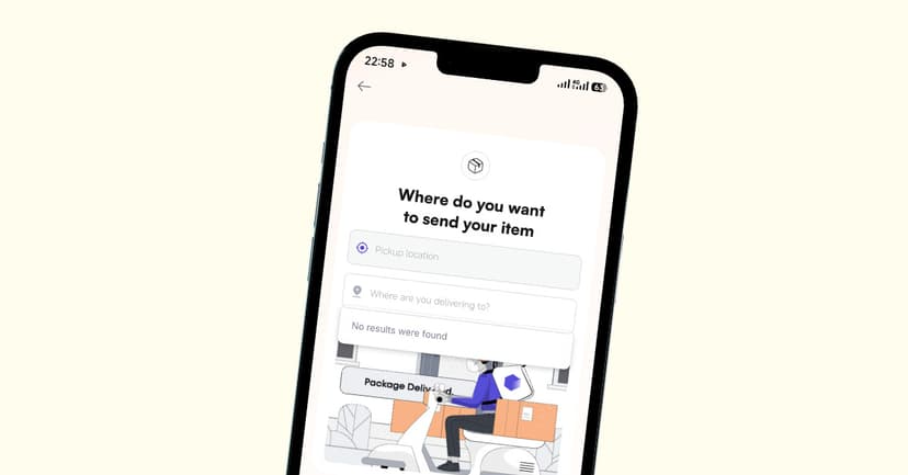
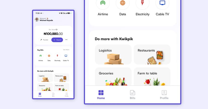
This is where Kwikpik enters your eCommerce equation.
As a specialized delivery and logistics company serving Africa and the Middle East, we bridge the gap between your e-commerce store and your customers’ doorsteps.
With features like real-time tracking, insurance coverage, and reliable delivery timeframes, you can promise customers not just great products, but a smooth delivery experience.
The most successful eCommerce businesses understand the relationships between powerful CTAs that drive conversions, and reliable logistics partners like Kwikpik maintain customer satisfaction after the purchase. Together, they create a complete solution that addresses both sides of the e-commerce equation.
So, as you implement these CTA strategies to boost your sales, remember that partnering with Kwikpik for your delivery needs completes the customer journey you've started.
If you want to chat with the team, schedule a call here.
Download our app| Become a rider| Become a business partner| Visit our social channels